Patrick Bateman Business Card: A Complete Breakdown of the Card That Quietly Dominated Design Culture

The patrick bateman business card isn’t famous because it’s loud.
It’s famous because it’s restrained — and restraint is rare.
At a glance, it looks like a normal business card. But the longer you look, the more you realize everything about it is intentional. The paper. The font. The spacing. Even what isn’t there.
That’s why people still search for the patrick bateman business card today — not just to copy it, but to understand what makes something so simple feel so powerful.
Let me break it down clearly, in real words, without overcomplicating it.
Table of Contents
Why the patrick bateman business card still stands out
Most business cards try to do too much:
- logos everywhere
- multiple colors
- taglines
- social media icons
Bateman’s card does the opposite.
It says, “I don’t need to impress you — I already belong here.”
That quiet confidence is what makes the patrick bateman business card unforgettable.
In real life, this same principle still applies. When design steps back, authority steps forward.
The paper: the first thing your hands notice
Before anyone reads the text, they feel the card.
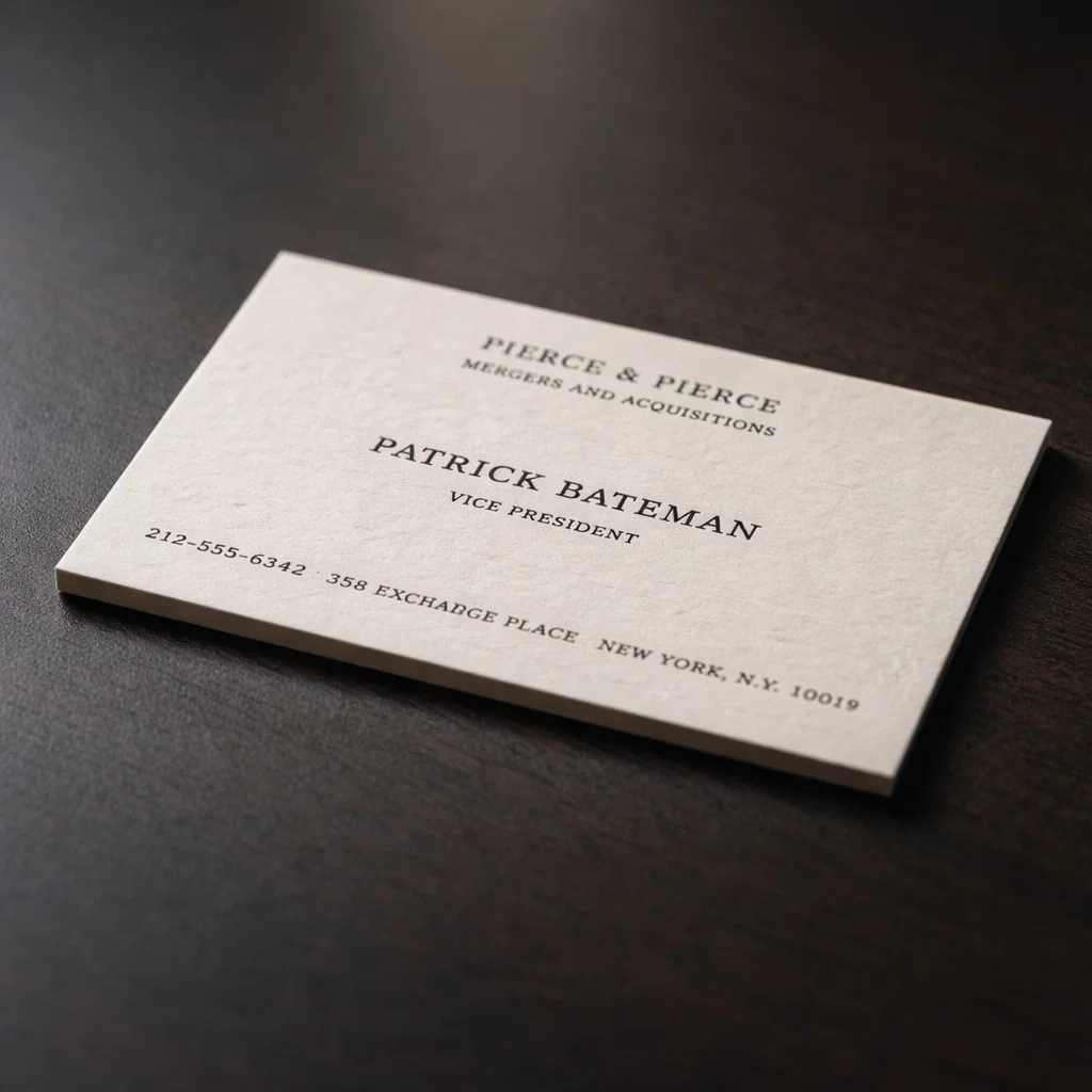
The patrick bateman business card is known for:
- off-white coloring
- thick stock
- uncoated texture
Why off-white matters
Bright white paper feels modern and disposable. Off-white feels intentional. It softens contrast and makes black ink look richer.
Why thickness changes perception
A thicker card:
- feels expensive
- bends less
- stays in memory longer
Real-life tip:
If a card feels flimsy, people subconsciously treat it like junk mail.
Texture: uncoated for a reason
The card isn’t glossy. That’s important.
Glossy paper reflects light and attention. Uncoated paper absorbs light and feels calm. It also:
- shows texture better
- works beautifully with pressed printing
- feels more “human”
This texture is part of why the patrick bateman business card feels serious instead of flashy.
Typography: the silent authority of the card
Typography is where the card truly does its work.
The main font style
The patrick bateman business card uses a classic serif font, most often identified as Sabon or a very close equivalent.
This style works because:
- it’s traditional without feeling old
- it’s professional without being stiff
- it’s readable at small sizes
Nothing about it tries to stand out — and that’s the point.
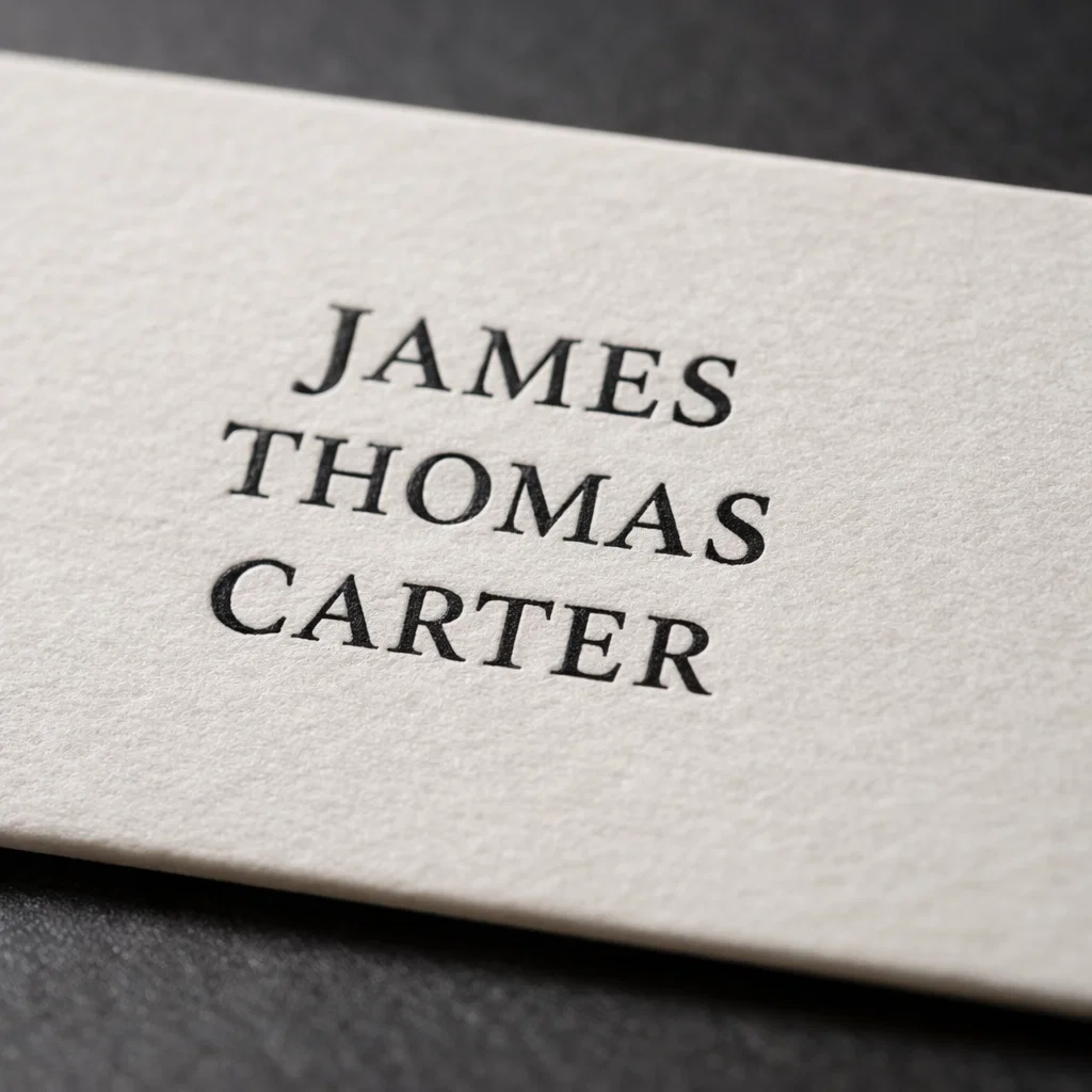
Small caps: the detail most people misunderstand
Many recreations fail here.
Bateman’s card does not use regular ALL CAPS text.
It uses small caps.
Small caps:
- are specially designed letters
- sit lower than full capitals
- create smoother spacing
They feel composed, not aggressive.
Real-life advice:
If your font doesn’t support real small caps, it’s the wrong font for this look.
The most ignored detail: old-style numerals

This is one of the biggest reasons replicas feel “off.”
The phone number on the patrick bateman business card uses old-style numerals.
Why this matters
Old-style numerals:
- vary in height
- blend into text naturally
- feel typographic, not mechanical
Modern lining numbers all sit at the same height, which feels stiff by comparison.
Quick test:
If your numbers look like little rectangles standing in line, they’re probably wrong.
Spacing: where luxury actually lives
Spacing does more work than color or graphics.
The patrick bateman business card uses:
- slightly tight letter spacing
- clean line spacing
- generous margins
Nothing feels crowded. Nothing feels accidental.
Real-life example:
If you’ve ever seen a card that looked “cheap” but couldn’t explain why — spacing was likely the issue.
The comparison that makes the scene work

The card scene isn’t about Bateman alone.
It’s about comparison.
Paul Allen’s card uses Copperplate Gothic, which feels:
- wider
- louder
- more status-hungry
Bateman’s reaction isn’t logical — it’s emotional.
Typography becomes a silent competition. One card feels restrained. The other feels showy. And that tiny difference is enough to break him.
That’s why the patrick bateman business card works narratively and visually.
Why this card still influences modern design
You still see its influence in:
- luxury branding
- minimalist personal brands
- creative portfolios
- premium stationery
Not because people want to copy a movie prop — but because the principles still work:
- fewer elements
- better spacing
- calmer typography
Design trends change. Restraint doesn’t.
How to recreate the patrick bateman business card (without copying it)
If you’re inspired by the card, here’s how to do it right.
What to borrow
- off-white thick paper
- serif font with small caps
- old-style numerals
- minimal content
What to avoid
- fictional company names
- movie quotes
- explaining the reference
- over-designing the back
Best approach:
Use the discipline of the design, not the joke.

Using a minimalist card in real life (without awkwardness)
Minimal cards demand confidence.
What works
- Hand it over casually
- Let the quality speak
- Keep your explanation simple
What ruins it
- Waiting for a reaction
- Mentioning the movie
- Treating it like a prop
When the card is calm, you should be calm too.
Frequently Asked Questions (FAQ)
What is the patrick bateman business card made of?
It’s known for thick, off-white, uncoated paper that feels substantial and refined.
What font is used on the patrick bateman business card?
A classic serif font, most commonly identified as Sabon, with small caps and old-style numerals.
Why does Paul Allen’s card look “better” in the scene?
Because it’s flashier. The contrast triggers insecurity, not actual design superiority.
Can I use this style for my real business card?
Yes — if you adapt the principles instead of copying fictional details.
What’s the most overlooked detail?
Old-style numerals and proper spacing.
{ “@context”: “https://schema.org”, “@type”: “FAQPage”, “mainEntity”: [ { “@type”: “Question”, “name”: “What is the patrick bateman business card?”, “acceptedAnswer”: { “@type”: “Answer”, “text”: “The patrick bateman business card is a minimalist off-white business card known for its thick uncoated paper, classic serif typography, small caps, and old-style numerals.” } }, { “@type”: “Question”, “name”: “Why is the patrick bateman business card so iconic?”, “acceptedAnswer”: { “@type”: “Answer”, “text”: “Its restrained design, subtle typography choices, and focus on texture and spacing turn a simple card into a symbol of quiet status.” } } ] }
{ “@context”: “https://schema.org”, “@type”: “BlogPosting”, “headline”: “patrick bateman business card: Why This Minimal Design Still Dominates”, “description”: “A complete, detailed breakdown of the patrick bateman business card, covering paper, typography, spacing, psychology, real-life usage, and FAQs.”, “author”: { “@type”: “Person”, “name”: “Your Name” }, “publisher”: { “@type”: “Organization”, “name”: “Your Blog Name” }, “mainEntityOfPage”: { “@type”: “WebPage”, “@id”: “https://yourwebsite.com/patrick-bateman-business-card/” }, “keywords”: [ “patrick bateman business card”, “american psycho business card”, “patrick bateman card design”, “minimalist business card” ] }