
American Psycho Business Cards: Why These Simple Cards Became a Cultural Obsession

The american psycho business cards are a perfect example of how something small can carry a huge emotional weight.
They’re just pieces of paper.
No color. No logo. No clever slogan.
And yet, they became one of the most talked-about details in modern film culture.
People don’t just search for american psycho business cards because they want replicas. They search because these cards quietly explain insecurity, status, and obsession better than most dialogue ever could.
Let’s break it down clearly, in real words, the same way I’d explain it to someone curious but not trying to overanalyze everything.
Why the american psycho business cards still matter
Most movie props fade into the background. These didn’t.
That’s because the american psycho business cards aren’t about design trends. They’re about human behavior—specifically how people compare themselves when they’re afraid of being ordinary.
Even today, people still:
- judge presentation before substance
- compare tiny details to feel superior
- perform success instead of feeling secure
That’s why these cards still resonate.
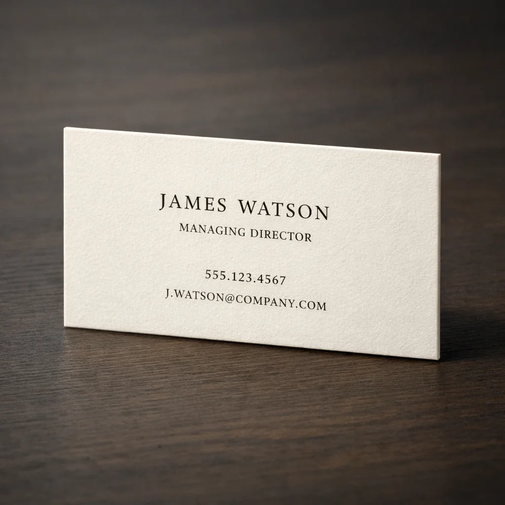
What makes the american psycho business cards instantly recognizable
At first glance, the cards look almost boring. That’s intentional.
They share a few defining traits:
- off-white (not bright white) paper
- thick, sturdy stock
- uncoated texture
- classic serif typography
- very little information
No logos. No color accents. No distractions.
The power comes from restraint, not decoration.
Why off-white paper matters more than people think
One of the most overlooked details in discussions about american psycho business cards is paper color.
Bright white paper feels modern, disposable, and mass-produced.
Off-white paper feels intentional and calm.
It softens contrast, makes black ink feel richer, and instantly signals “this was a choice.”
Real-life tip:
If your card looks white under every type of light, it’s probably too bright.
Thickness: the first impression your hands make
Before anyone reads a name, they feel the card.
The american psycho business cards are known for their thickness because thickness communicates:
- expense
- permanence
- seriousness
A thin card feels temporary. A thick card feels considered.
Real-life example:
If someone subconsciously bends your card while holding it, you’ve already lost part of the impact.
Texture: why uncoated beats glossy here
Glossy cards reflect light and attention.
Uncoated cards absorb light and feel calm.
The american psycho business cards use uncoated stock because it:
- feels more tactile
- looks softer under light
- pairs well with pressed or debossed printing
This texture helps the card feel “quietly expensive” instead of flashy.
Typography: the silent authority of the cards

Typography does most of the psychological work.
The fonts used on american psycho business cards are classic serif styles—most commonly associated with tradition, stability, and professionalism.
They’re not trendy. They’re not expressive. They’re controlled.
Small caps (not full caps)
Many people miss this.
The cards use small caps, not regular ALL CAPS text. Small caps:
- feel more balanced
- space better
- look refined instead of aggressive
This is a subtle but critical difference.
The most ignored detail: old-style numerals

Almost no casual recreation gets this right.
The phone numbers on american psycho business cards use old-style numerals, which:
- vary in height
- blend naturally with text
- feel traditional
Modern lining numbers look rigid by comparison.
Quick test:
If your numbers all sit at the same height like tiny blocks, they’re probably wrong.
Why the cards are almost identical (and why that’s the point)
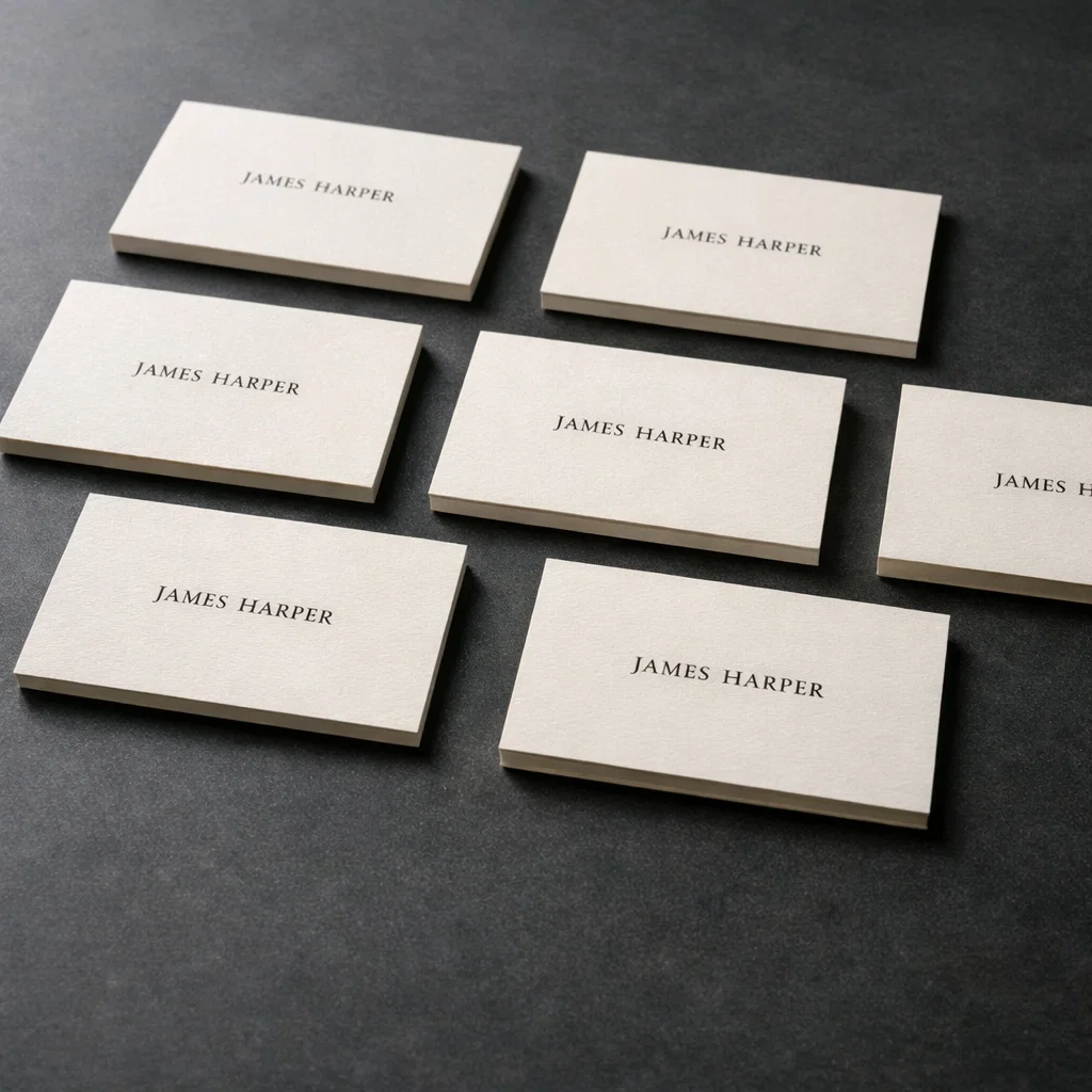
One of the smartest things about the american psycho business cards is how similar they look.
That similarity reflects the characters themselves:
- same jobs
- same clothes
- same routines
- same goals
When everyone looks the same, tiny differences become emotionally massive.
That’s why people obsess over paper shade and font weight—it’s all they have left.
The psychology behind the obsession
The cards become stand-ins for identity.
Instead of saying:
- “I’m better than you”
- “I’m more successful”
The characters say:
- “Look at the thickness”
- “Look at the color”
- “Look at the type”
The american psycho business cards turn insecurity into socially acceptable competition.
Why people still recreate american psycho business cards
People recreate these cards for different reasons:
- design inspiration
- collector interest
- minimalist branding ideas
- cultural reference
But the recreations that work best don’t copy blindly. They understand why the design works.
Common mistakes when recreating the look
Here’s where many people go wrong:
- using bright white glossy paper
- choosing trendy fonts
- ignoring spacing
- using full caps instead of small caps
- adding logos or icons
- over-explaining the reference
The original cards work because they don’t try to impress.
How to apply the american psycho business cards style in real life
You don’t need to copy anything exactly.
Instead, borrow the principles:
- fewer elements
- better spacing
- thicker paper
- calmer typography
What works
- clean layout
- minimal content
- high-quality materials
What doesn’t
- quoting the movie
- using fictional company names
- turning it into a joke
Minimal design only works when it’s confident.
Using a minimalist card without feeling awkward
A quiet card requires quiet delivery.
Do this:
- hand it over casually
- say nothing special
- let people notice on their own
Don’t do this:
- wait for a reaction
- explain the inspiration
- perform confidence
Confidence shows up best when it’s not announced.

Why the american psycho business cards still influence design today
You can still see their influence in:
- luxury branding
- personal portfolios
- high-end stationery
- minimalist identity systems
Not because people want to copy a movie—but because restraint ages well.
Frequently Asked Questions (FAQ)
What are american psycho business cards?
They are minimalist off-white business cards known for thick paper, classic serif typography, small caps, and subtle details that symbolize status and insecurity.
Why are the cards so simple?
Because restraint communicates confidence more effectively than decoration.
What paper works best to recreate the look?
Thick, uncoated, off-white paper with a subtle texture.
Can I use this style for my real business?
Yes—if you adapt the principles instead of copying fictional details.
What detail do most people miss?
Old-style numerals and spacing.
{ “@context”: “https://schema.org”, “@type”: “FAQPage”, “mainEntity”: [ { “@type”: “Question”, “name”: “What are american psycho business cards?”, “acceptedAnswer”: { “@type”: “Answer”, “text”: “American psycho business cards are minimalist off-white cards known for thick uncoated paper, classic serif typography, small caps, and subtle design details.” } }, { “@type”: “Question”, “name”: “Why are american psycho business cards so iconic?”, “acceptedAnswer”: { “@type”: “Answer”, “text”: “They represent quiet status, insecurity, and competition through restraint rather than flashy design.” } }, { “@type”: “Question”, “name”: “Can I use this style for my own business card?”, “acceptedAnswer”: { “@type”: “Answer”, “text”: “Yes, by applying the principles of minimalism, quality materials, and careful typography without copying fictional elements.” } } ] }
{ “@context”: “https://schema.org”, “@type”: “BlogPosting”, “headline”: “american psycho business cards: Why Minimal Design Feels So Powerful”, “description”: “A complete, human-written guide to american psycho business cards, covering design, psychology, paper, typography, real-life use, and FAQs.”, “author”: { “@type”: “Person”, “name”: “Your Name” }, “publisher”: { “@type”: “Organization”, “name”: “Your Blog Name” }, “mainEntityOfPage”: { “@type”: “WebPage”, “@id”: “https://yourwebsite.com/american-psycho-business-cards/” }, “keywords”: [ “american psycho business cards”, “american psycho business card”, “patrick bateman business card”, “minimalist business card design” ] }