American Psycho Business Card Font: The Complete Font Breakdown Most People Get Wrong

Every time someone searches for the american psycho business card font, they’re not just asking, “What font is this?”
What they really want to know is why it feels so powerful, and why most recreations never quite get it right.
I’ve seen countless articles list font names and stop there. But that’s not how typography works in real life. A font isn’t just a file — it’s how it’s used. And in this case, tiny decisions make a massive difference.
So let me walk you through the american psycho business card font properly, the same way I’d explain it to someone sitting across from me, curious but not trying to become a design professor.
Table of Contents
Why the american psycho business card font feels elite (even before you notice it)
Here’s something people rarely talk about:
Your brain reacts to typography before you consciously read the words.
The american psycho business card font feels elite because it sends silent signals:
- discipline
- tradition
- control
- restraint
There’s nothing playful about it. Nothing trendy. And that’s exactly why it works.
In real life, the same principle applies. When typography is quiet, people assume confidence.
The main font used: Sabon (and why it works so well)
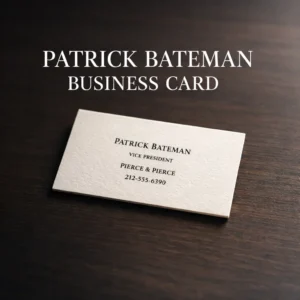
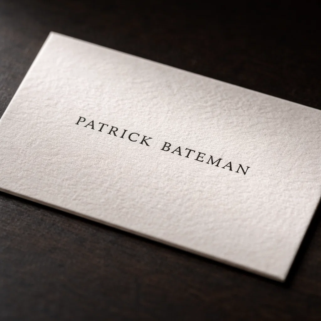
Patrick Bateman’s card is most often identified as using Sabon, a classic serif typeface designed for balance and readability.
What makes Sabon special for this card
Sabon sits in a very specific design space:
- Not modern
- Not old-fashioned
- Not decorative
- Not boring
It’s calm. And calm typography feels expensive.
That’s why Sabon fits the american psycho business card font so perfectly. It doesn’t compete for attention — it assumes authority.
Font anatomy: details you probably never noticed (but felt)
Let’s break the font down in human terms.
1. Serif shape
The serifs are:
- clean
- slightly bracketed
- not sharp or aggressive
This creates a smooth reading rhythm, even at small sizes.
2. Stroke contrast
Sabon has moderate contrast — thick and thin strokes exist, but they’re not dramatic.
High contrast = flashy
Low contrast = dull
Balanced contrast = refined
That balance is key to the american psycho business card font look.
The most ignored detail: old-style numerals

This is where most replicas fail.
The phone number on Bateman’s card uses old-style figures, not modern lining numbers.
Why old-style numerals matter
Old-style numbers:
- sit at different heights
- blend into text naturally
- feel traditional and typographic
Modern lining numbers are all the same height and feel mechanical.
Real-life tip:
If your software shows an “OSF” or “Old Style Figures” option — turn it on. This single change instantly elevates the american psycho business card font look.
Small caps vs full caps (this is not the same thing)
Another common mistake: typing everything in ALL CAPS.
That’s not what’s happening.
Bateman’s card uses small caps, which are specially designed letters — not resized capitals.
Why small caps feel better
- More even spacing
- Better proportions
- Less shouting
- More control
Psychologically, small caps feel composed. Full caps feel loud.
If you’re serious about the american psycho business card font, small caps are non-negotiable.
Letter spacing: the invisible luxury
You can use the correct font and still mess it up with spacing.
The original look uses:
- slightly tightened tracking
- very consistent spacing
- careful alignment
Too loose = amateur
Too tight = desperate
Real-life advice:
Always adjust spacing manually. Default font spacing is rarely ideal for business cards.
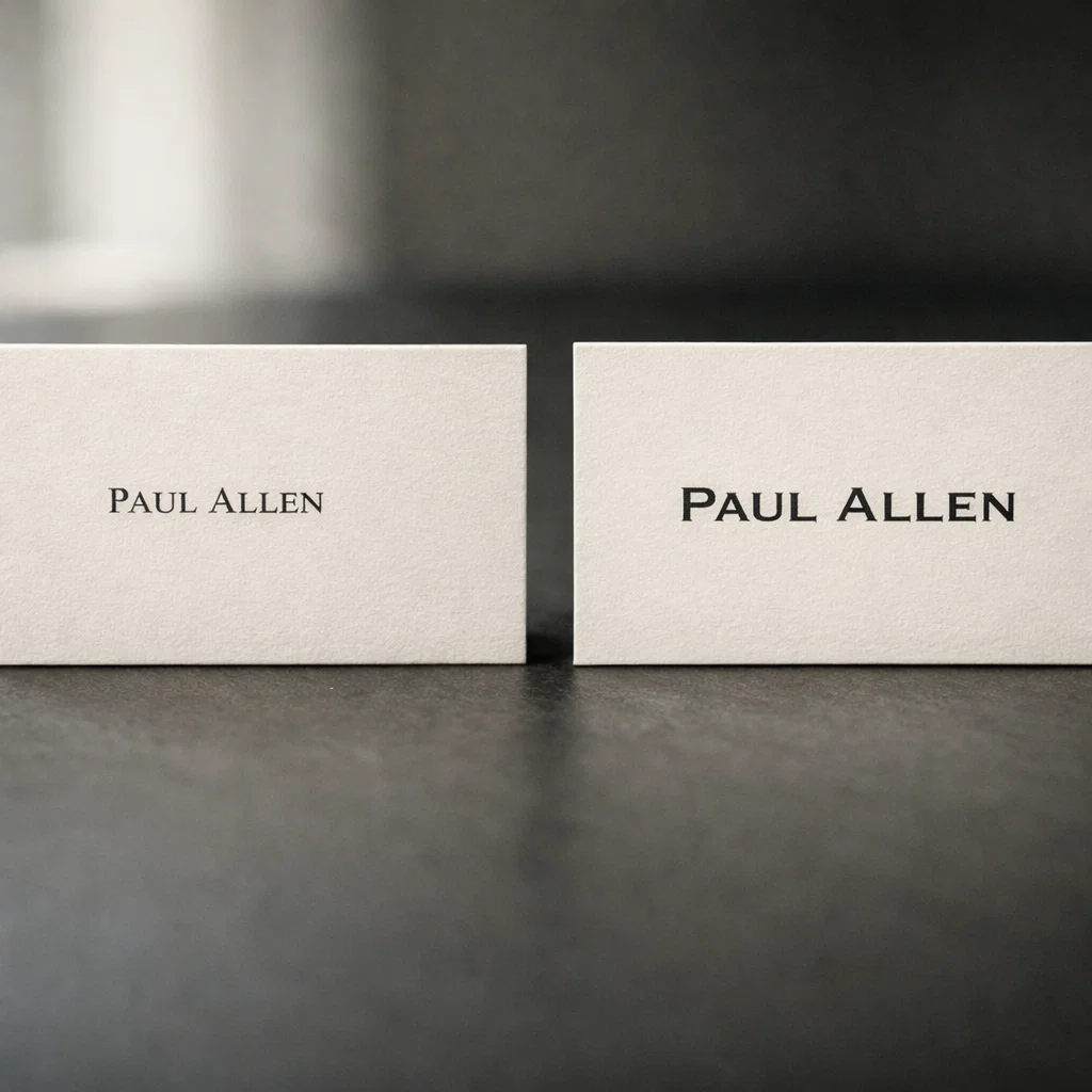
Paul Allen’s card uses a different font — and that’s intentional
This is one of the smartest design choices in the entire scene.
Paul Allen’s card uses Copperplate Gothic, not Sabon.
Why Copperplate Gothic feels different
- No lowercase letters
- Wide spacing
- Engraved, bold look
It feels:
- flashier
- louder
- more status-hungry
Typography tells a story without dialogue. The contrast between fonts reflects personality differences — something most articles never explain when discussing the american psycho business card font.
Why most recreations feel “off” (even when the font is correct)
Here’s a checklist of common problems:
- Wrong numeral style
- No small caps support
- Poor spacing
- Cheap digital print
- Thin paper
- Too much information
- Using trendy fonts “inspired by” the look
The american psycho business card font works because nothing extra is added.
Best modern font alternatives (if you can’t access Sabon)
Not everyone has access to Sabon. That’s fine.
Free alternatives
- EB Garamond (enable small caps + old-style figures)
- Libre Baskerville (clean, readable, traditional)
Paid alternatives
- Adobe Garamond Pro
- Sabon Next
- Minion Pro
Important:
If a font doesn’t support small caps and old-style numerals, it will never fully match the american psycho business card font feel.
How to use the american psycho business card font in real life (without being awkward)
Let’s keep this grounded.
What works
- Name
- Title
- Company
- Minimal contact info
What ruins it
- Quotes
- Movie references
- Over-branding
- Explaining the design choice out loud
Minimal typography only works when you let it speak quietly.

Typography psychology: why this font still works today
People trust what feels familiar and controlled.
The american psycho business card font sits right in that zone:
- classic but not dated
- formal but not stiff
- simple but not plain
That’s why it still works in professional settings — not because it’s iconic, but because it’s disciplined.
Frequently Asked Questions (FAQ)
What is the american psycho business card font?
It’s most commonly identified as Sabon, set in small caps with old-style numerals and tight spacing.
Is Garamond the same as the american psycho business card font?
No. Some Garamond styles look similar, but spacing, numeral style, and proportions make the real difference.
Why does Paul Allen’s card look better to Bateman?
Because Copperplate Gothic feels louder and more status-driven — which triggers insecurity.
Can I legally use this font?
Yes, as long as you license the font properly or use a free alternative.
What detail matters most?
Old-style numerals. Almost everyone ignores them.
{ “@context”: “https://schema.org”, “@type”: “FAQPage”, “mainEntity”: [ { “@type”: “Question”, “name”: “What is the american psycho business card font?”, “acceptedAnswer”: { “@type”: “Answer”, “text”: “The american psycho business card font used for Patrick Bateman’s card is most commonly identified as Sabon, using small caps and old-style numerals.” } }, { “@type”: “Question”, “name”: “Why does Paul Allen’s card use a different font?”, “acceptedAnswer”: { “@type”: “Answer”, “text”: “Paul Allen’s card uses Copperplate Gothic to visually signal a louder, more status-driven personality through typography.” } } ] }
{ “@context”: “https://schema.org”, “@type”: “BlogPosting”, “headline”: “american psycho business card font: A Complete Typography Breakdown”, “description”: “A deep, practical guide to the american psycho business card font, covering Sabon, small caps, old-style numerals, spacing, psychology, and real-world usage.”, “author”: { “@type”: “Person”, “name”: “Your Name” }, “publisher”: { “@type”: “Organization”, “name”: “Your Blog Name” }, “mainEntityOfPage”: { “@type”: “WebPage”, “@id”: “https://yourwebsite.com/american-psycho-business-card-font/” }, “keywords”: [ “american psycho business card font”, “patrick bateman business card font”, “paul allen business card font”, “sabon font”, “business card typography” ] }